
At a Glance
Dashboards is the analytics page in Insights. It brings financial, billing-operations, and clinical metrics onto one page, with the same global filters applied across every tile. Every metric is traceable. Click a tile and you land on the claims or appointments behind the number, grouped by payer or facility, with a link straight into the claims worklist to act on what you find. You never have to export a report to answer the next question. The numbers are queried live — there is no report to generate and wait on. Each dashboard shows Data last refreshed next to the filter bar, so you can tell whether a number reflects this morning’s posting.Dashboards is new. If you do not see Dashboards in your left navigation, your role may not include access yet — your practice’s admins control who can open the page, or reach out to your account manager.
Getting to Dashboards
Select Dashboards in the left navigation. You land on the dashboard gallery, which lists the out-of-the-box templates you have access to alongside any dashboards your practice has built.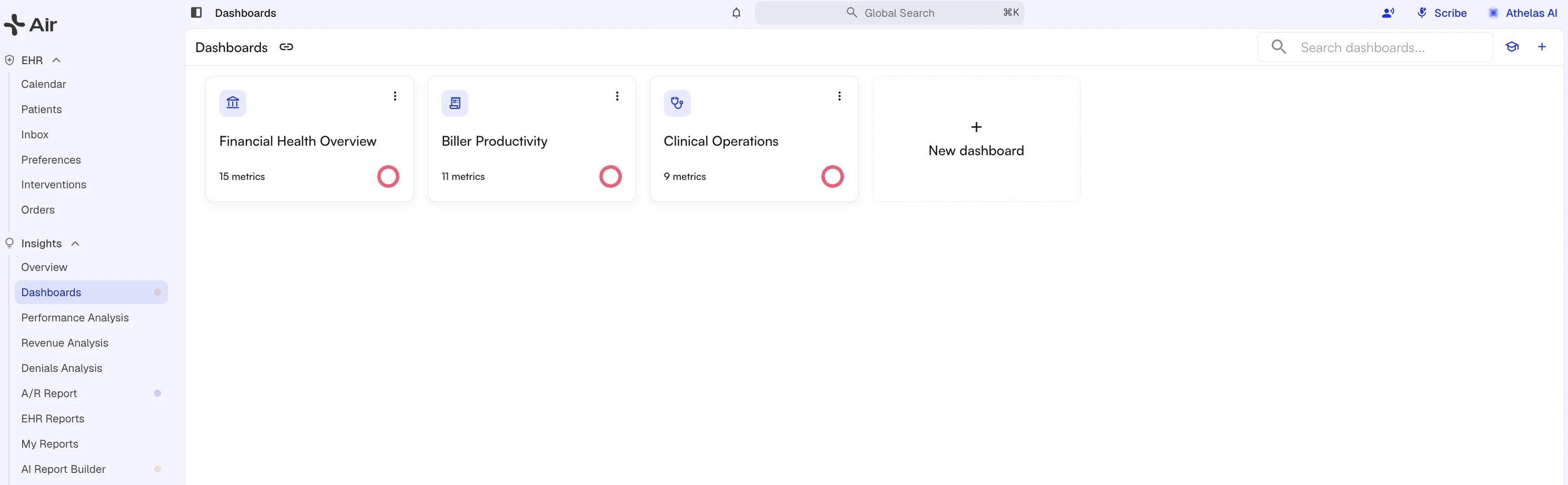 The search box and New dashboard sit in the page toolbar, next to the Dashboards breadcrumb. Search filters the gallery by dashboard name or category.
Out-of-the-box Templates
Each template is a curated set of metrics for one audience. You can open a template directly, or duplicate it and edit your copy.
Note: The Clinical Operations template draws on Air scheduling data and is enabled for select accounts. Ask your account manager if you would like it turned on.
Global Filters
The filter bar at the top of a dashboard applies to every tile on it.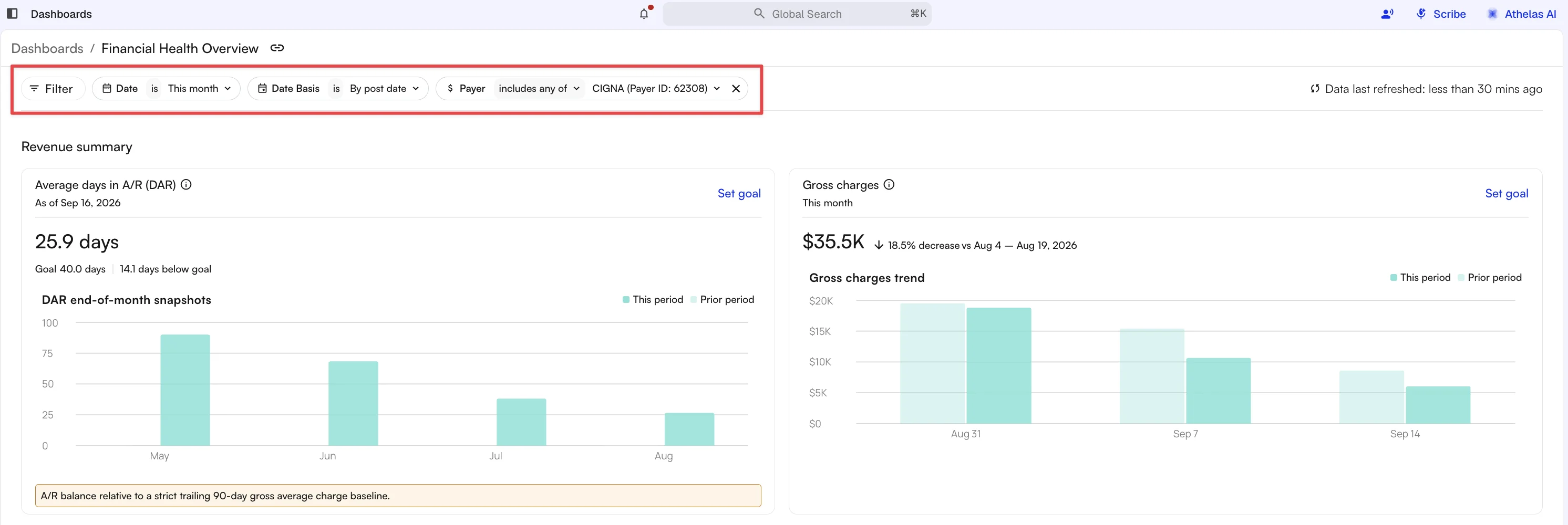 Every dimension filter supports both includes any of and includes none of, so you can exclude a payer or facility instead of listing all the others.
Reading a Tile
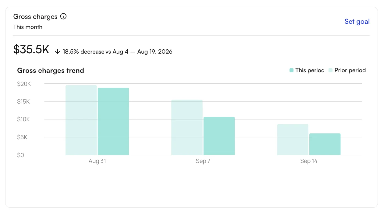 Each tile shows the metric for your selected window, how it compares to the prior period, and a trend chart broken into time buckets. Hover a bar or point for the exact value.
Select the metric name to see its definition and the calculation behind it.
Each tile shows the metric for your selected window, how it compares to the prior period, and a trend chart broken into time buckets. Hover a bar or point for the exact value.
Select the metric name to see its definition and the calculation behind it.
Setting a goal
Select Set goal on a tile to enter a target and the Time period it applies to. The period list is built from the date range you are viewing: the whole year first, then one entry per bar on the trend chart. The goal renders as a line on the tile’s trend chart, so progress against it is visible at a glance. Once a goal is set, a trash icon appears in the field: select it to empty the value, then Save.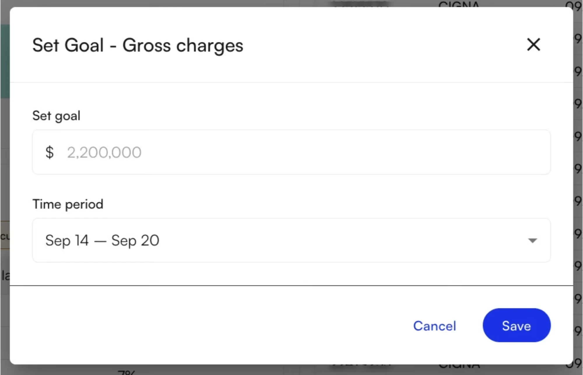
Drilling Into a Metric
Select a tile to open its drilldown, which lets you see the claims behind the metric.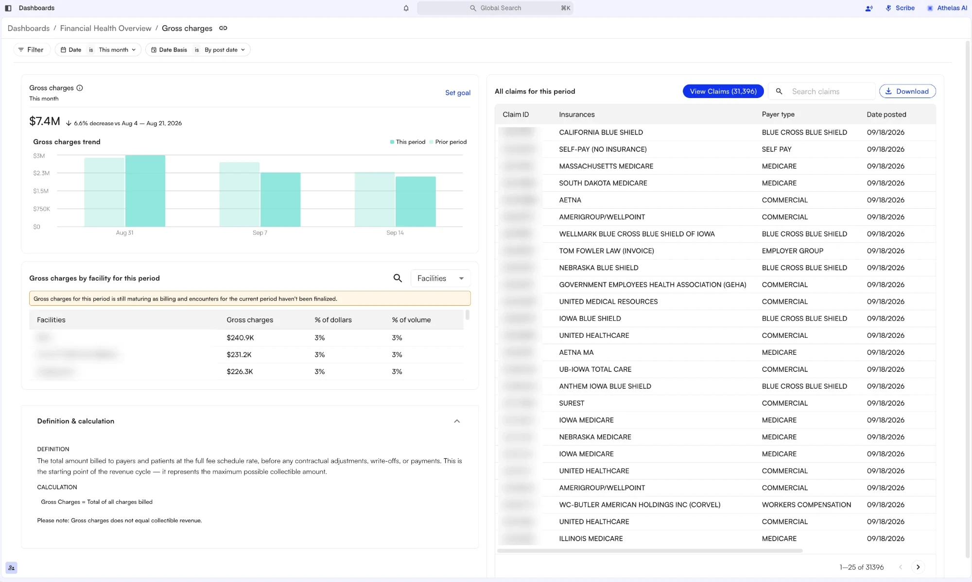 In the drilldown you can:
- Group the metric by payer or facility to see each group’s share of the total.
- Select a group to narrow everything below it to that payer or facility.
- Review the underlying claims, including claim ID, date of service, charges, and insurance paid.
- Download the claims as a CSV when you need the raw rows in a spreadsheet.
- Select a claim to open it in the claims page with full context, or select View Claims, to send the whole filtered set to the claims worklist and work it there.
- Expand Definition & calculation at the bottom for the metric’s definition and formula.
From metric to action
Every metric follows the same loop: start at the tile, drill into the records behind the number, open them in the claims workspace, and ask Athelas Assistant what it sees. The walkthrough below runs that loop end to end, using denials as the example.Building Your Own Dashboard
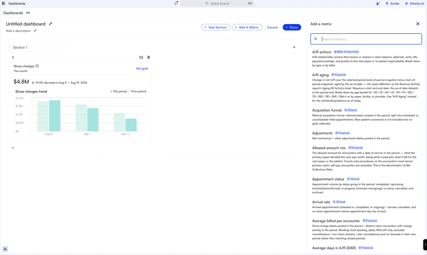
You can assemble a dashboard from the metrics library instead of using a template.- From the gallery, select New dashboard to start from a blank canvas, or open the ⋮ menu on any card and choose Duplicate to start from a copy of a template or an existing dashboard.
- Name the dashboard and, optionally, give it a description — select the pencil to edit, then press Enter or click away to save. The description shows under the filter row when the dashboard is open, and on its card in the gallery.
- Name your first section — sections group related tiles, so a dashboard might hold a Financials section and a Productivity section. Add Section creates more.
- Select Add A Metric to open the metrics panel. Each metric is tagged Financial, Biller Productivity, or Clinical and carries a short definition, and the search box filters across all of them.
- Select a metric to place it in the section. Set each tile to a third, a half, or the full width of its row, drag tiles into the order you want, and remove any you do not need.
- Add as many sections as you need, then select Done. The dashboard appears in the gallery next to the templates. Cancel discards the draft.
Who can see what
Access is granular, so two people can open the same dashboard and see different things. Your practice’s admins set these in Settings → Roles.
The last two change the numbers rather than the layout. A biller limited to their own assignee data opens the Biller Productivity template and sees their own throughput, not the practice’s — which is usually the intent, and worth knowing before comparing figures with a colleague.
The Metrics Library
These are the metrics available when you build a dashboard. The library grows regularly, so the panel in the product is always the current list.Exports
Every drilldown exports its claims to CSV with Download. For the standing reports your practice runs on a schedule, use My Reports. The Revenue Analysis and Denials Analysis pages remain available alongside Dashboards.FAQ
What is the difference between clean claims rate and first pass rate?
What is the difference between clean claims rate and first pass rate?
Clean claims rate counts claims submitted without errors that needed rework before the payer adjudicated them. First pass rate counts claims that needed no rework after the first submission.Note: A biller who works denials and submission errors all day can show a low or zero first pass rate by design, because the claims they touch are already on their second pass. Read those two metrics against what the person’s queue actually contains.
Why don't the claim submission funnel and Denials show the same number?
Why don't the claim submission funnel and Denials show the same number?
They count different things. The claim submission funnel takes the encounters serviced in your date range and breaks them down by the status each one sits in today. Denials counts the denials that occurred during the date range, whatever status those encounters are in now.Note: An encounter serviced in January and denied in March is counted in January’s funnel under its current status, and in March’s denial figure. The two answer different questions, so a gap between them is expected rather than a sign that either is wrong.
A metric I need isn't in the library. Can it be added?
A metric I need isn't in the library. Can it be added?
Yes. We’re adding to the metrics library regularly, driven by requests from practices. Send the metric and its definition to your account manager.